Friday, 28 October 2011

Proposal

Target Audience


The target audience for my magazine will be teenage boys who are interested in sport and new rock/ alternative music. This means that the magazine will have articles about new music which has a rock/ alternative genre and it will also include sport not only inside the college but local sport.


Typical Content


Just as I said before the magazine will include articles about new rock/alternative music. This will include new and upcoming local bands and singers. These could also include bands that are in college. It will also include articles on sport in college and results from sport in the local community. It could also include events that the target audience would like to go to. It could involve food in the way of cafes inside college and local food. It could also include new local shops and local advertisements and offers.

Cover Lines
                                   
These would all include snippets of articles which will give slight information about the articles. For Example there could be one saying ‘Shock Result for Portsmouth’ or ‘New Band Rocks the South’


Title


I have decided on SDC magazine because it represents South Downs College yet it still keeps the young and modern theme.


Fonts


sdc magazine
 I would like to use this font for my mast head because it stands out and is bold to catch people’s eyes. It also is easy to read so that it can be read easily. The font is Xenophone.


I want to use this font for my magazine contents page and the cover lines because it is simple to read and it is modern. The font is Tahoma.


Times Published


My magazine will be published every month and will change due to the monthly seasonal changes. For example in December it will have a specific Christmas theme and the events will mostly be based on Christmas and New Years. Also in February there will be a specific theme of Valentine’s Day.  These themes will be portrayed in the colours used and the articles that will be included in the magazines for example there would be Christmas music news involved in the magazine and there will also be specific events for the time of year.


Kind of images on cover


There could images of the new band(s) which will be featured in the magazine. There could also be images of food that is new in the cafes or there could be images of sports in the local area. There could also be images of the new events like advertisements and posters.


Colours


The basic colour scheme will be white background but will also include the font colour of black but using blue and green as well. This is to keep to the South Downs theme. But it will also include some other bright colours which will attract peoples’ eyes to the magazine cover.


Size


The magazine will be A5 size so that it can be easily fit into any bag.


FlatPlans

Cover
Contents Page

Initial Ideas

Magazine Audience;

Teenage Boys aged 16-18 at college- The magazine will have to give information that this audience would like, so it could be information on music and sports that would also be aimed at this audience.
Teenagers 13-15 not yet at college yet- The magazine could give information about what goes on at the college and why they should come to college. These could be handed out on open evenings.

Topics;

Food- Cafes inside college and nearby.
Music- New music and music that is going around the college.
College Gossip- What’s new in college.
Learning to drive- Tips and Hints
Sports- Notices
Events- Near college
Fashion- NUS Discounts

Titles and Fonts;

College Times        Impact Harlow Solid Italic
Students               Bauhaus 93
sdc Magazine             xenophone

Images:

Of the college- New
Students- Musical/ Sports
Cars- Driving
Events- Adverts


Tuesday, 11 October 2011

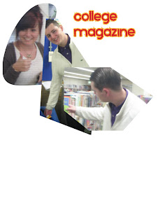
College magazine cover

To make this page I had to place the images in boxes on the page in InDesign. I then could manipulate them by using the black arrow and dragging the sides of the box in different directions so I got the shape that I wanted. I then placed the images on top of each other slightly and experimented what looked better. I then added a title changing the font and colours as well as the stroke weight until it looked suitable for the audience, which in this case is college students. 

Monday, 10 October 2011

To what extent should magazines be held responsible for the social ramifications of the representations they offer?


                I think that magazines are highly responsible for the results of displaying, in such widely read magazines; social ideas that teenage girls do not need to worry about but are forced too by these magazines.
                There are many different things that teenage magazines portray that have ramifications on teenage girls’ lives. An example of this is the way that magazines display ‘perfect’ girls. This in a sense means that they are slim and have good health. This could be a positive ramification. The way it could be positive could be that teenage girls would want to eat healthier so that they get slim and look like the ‘perfect’ girl on the front of the magazine. But for many this ends up to be a negative ramification in the way that the girl could develop an eating disorder just because they choose not to eat so that they become slim. This can cause astronomical emotional damage to them. Even without developing an eating disorder the girl could still feel a lot of emotional pain in the way they look because they don’t look like the girl on the cover. This could lead to them feeling left out of different to the world around them. This sort of emotion can spiral into self-hatred and self-harming. 
                Another consequence on the social lives of teenage girls is how they are exposed to sexual themes at a very young age. This is a very big issue and it has even been raised in the news. Although this is shocking to the parents, it is also in breach of the industry’s editorial code.  This issue was first raised on ‘watchdog’ and was then transferred into ‘The Telegraph’ for wider viewing. These sexual themes are being read by girls as young as 11. The fact that these sorts of themes are being read by girls of such a young age could lead to underage sex and maybe underage pregnancy. It could also lead to a few girls feeling like they are not normal  if they are not having sex even if their friends are not they probably would keep it to themselves as to not be seen as different because the magazines suggest that they should be doing it. But it is not just the sexual themes that these magazines portray it is just the theme of being in a relationship. By raising this theme it could lead to many girls being forced into a relationship which they feel they are not ready for. Maybe they don’t want to have a boyfriend but at the risk of being different they do it anyway.  They would not be alone.  This is because everyone else reading the magazine will most likely feel like they have to follow the themes therefore will be in a relationship. But that particular girl may feel all alone because they do not want to be in one but again at the risk of being an outsider or to be considered not normal they stay in that relationship.  
                Fashion is another big social ramification of the teenage magazines. This is because there are many clothes advertised in these magazines. The fact that they are advertised, not only on their own but with models suggest that they are in fashion so the readers need to buy them. The readers will feel obligated to buy these clothes because they would not want to risk being out of fashion as fashion seems to play such a massive part on the modern teenage girls life.
                I think that there should be more of an obvious target audience for teenage magazines. So ones for older ie 16-19 and ones for 13-15 should be considerably different and possibly have an age restriction when buying so that young teens are not exposed to things that are not necessary in their lives. So magazines should either remove items that are not appropriate for young teens or they should add an age restriction of 16 to buy these magazines. Another solution is to add alternatives in the magazines for examples there should say it is okay to not have a boyfriend or suggest possible cheaper alternatives for the clothes that are in fashion.

Here are a couple of links to websites where I found some information about this topic:


Teenage Girl Magazine Covers


Colours- They have all used bright colours to grab the audiences attention. On three of the magazines the colour pink has been used this signifys the ‘girlyness’  of the magazine.  They have all used colours which match with the other colours so there are no clashes so it is eyecatching but not too loud.  The colours look good with each other, this is because they have used complenetary colours so the magazine looks professional but still has the casual teen feel that the audience would want. All the magazines have a reduced pallette meaning that they have only chosen to use a few colours not lots of different ones so it keeps the house style and the proffessionalism that teenagers would want as the grow to adulthood.
Image/s-  All of the main images are of celebrity women who are fairly young. Three of them; Bliss, Cosmogirl and Sugar have all used teenage models for there main images to connect with what the teenagers want. All the models represent what is to be found inside.The age of the models is important because the fact that they are so young means that the audience will feel like they can connect with them or be like them in the near future. They act as role models.  Also the fact that they are nearly all smiling represents the fun and joyful inside of the magazine.  The clothes worn also suggest what is going to be in the magazine.  All of the models on the covers are wearing very feminin  clothes which shows that this theme of femininity will be contiued throughout the magazine.
Cover lines- There are a lot of cover lines on the front of these teenage magazines. This could be to draw the audience in because teenagers can get bored easily and so the magazine knew that they want a lot to be able to read so as to not get bored. So by putting a lot of cover lines on the magazine cover it makes it look a lot more exciting.  Also the cover lines are all about what teenagers would want to know about for example on the cover of Bliss it says ‘Does popular= Happy?’ This is a very teenage scenario. In teenage life there has always been this sense of having to be popular so this article will draw the audience in. Also using cover lines for articles which are unsual for example on the Sugar cover, ‘Animal Attack ‘I was eaten alive by a wild bear’’. These types of strange articles make people look twice to and think about how interesting it would be to read an article like this, so they will pick up the magazine.
Font- The font on all of these magazines is big and easy to read. The idea of this is that it stands out from far away. Therefore, it catches your eye from distance meaning you will go over and see what the magazine is. They also make it clear to read so that they can have a wider audience in the way that everyone will be able to read it. They also slightly change the font for different parts of the cover to give an exciting page that fits with what the cover line is talking about.  

Audience for 'KERRANG!' magazine

I think that the audience for this magazine will be people who like rock music. This is evident because the bands featured are all of a rock nature. Also the classic colours for rock music the dark red and the black giving the impression of hell. Rock music always seems to have this feel of darkness not generally happy music. These two colours represent this really well. Also the masthead of the magazine, the ‘KERRANG!’ part, is sort of sliced out. This relates to rock music in the sense that it can be related with destruction i.e. the instruments.  I think that this magazine will be aimed at a teenage audience rather than a more mature audience because these are the people who tend to like this sort of music and who would most likely be interested in buying a music magazine. But there are a lot of adults who would be interested in this magazine because they also like rock music but might not want to spend their money on a magazine. I also feel that it is aimed at teenagers because of the fact that there are posters in the magazine. Although there probably are adults who have posters in their rooms I would have thought that teenagers would be more likely to enjoy the posters and use them more than the teenagers. So if this magazine was aimed at adults they probably would not include the posters.  Teenagers would be attracted to this magazine cover because there are a few bright colours that stand out and catch their eyes. The main cover line of ‘YOU ME AT SIX’ stands out and because they are a band which many teenagers like they would instantly be interested. By picking a band that many teenagers like they are trying to appeal to their desires of having an interview with a band that they like. Also the fact that the cover is quite busy, in other words there is a lot on it, would interest teens because teenagers can get quite bored easily so they want something that they know will be interesting for a long time. By having a lot of the adverts on the front it gives the audience more information about what will be inside so they know exactly what is going on. The teenagers would like this because they wouldn’t want to pick up a magazine if they are not sure what it is going to be about. 

Conventions of a magazine cover

 Mast Head- The mast head is to show what the magazine is and what type of genre it is. This is instantly recognisable to most people because it is a well-known rock magazine and T.V. channel.
Main cover line- This gives more information about what will be in the magazine. It is generally the main article. By this people will be able to decifer whether this is a magazine they would look to buy if they had not worked it out before by the masthead.
Cover lines- The cover lines give extra information about what’s in the magazine they can be adverts for competitions as on this one or they can be separate smaller articles which will also be in the magazine. The audience can then have an informed decision on whether to buy it or not. The volume of cover lines could suggest that the audience will get more for their money as there are a lot of articles in this magazine.
Main image- This is the largest image on the cover generally directly related to the main cover line.
Bar code- This gives the shopkeeper a way of keeping track of the sales of the magazine by being able to scan it. It also has the date and the issue number so the customer will know if this is the newest edition.